
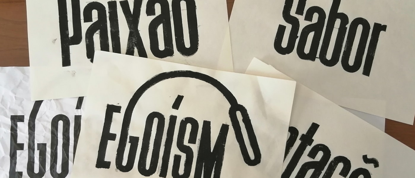
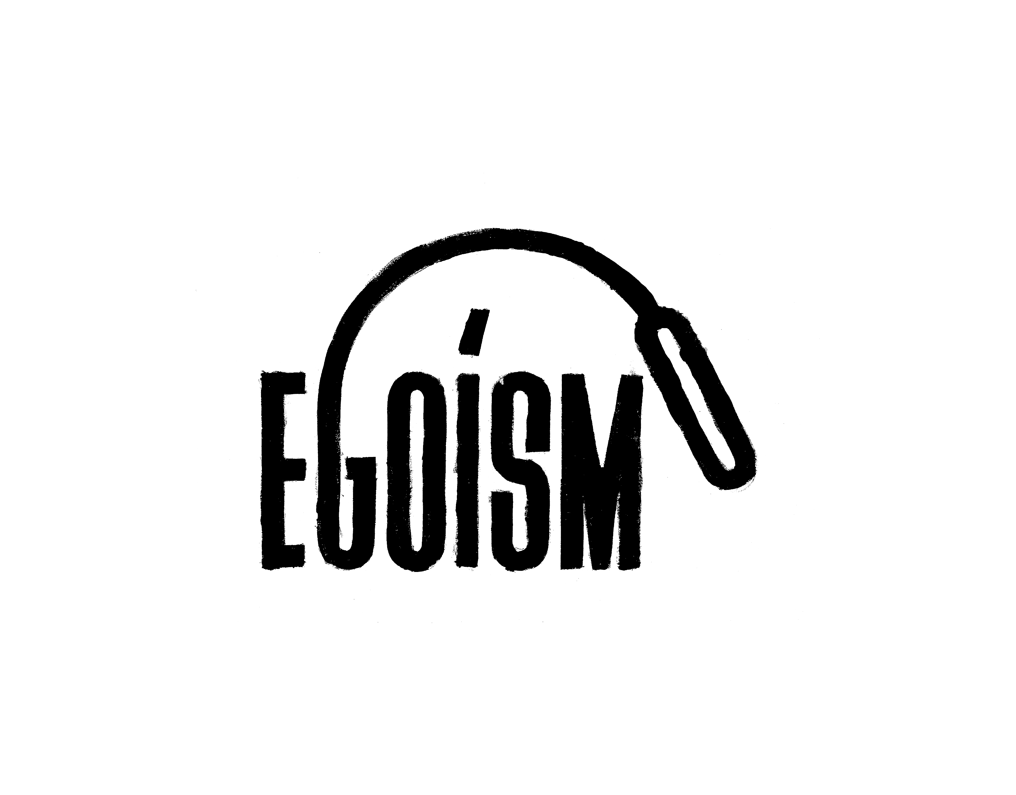
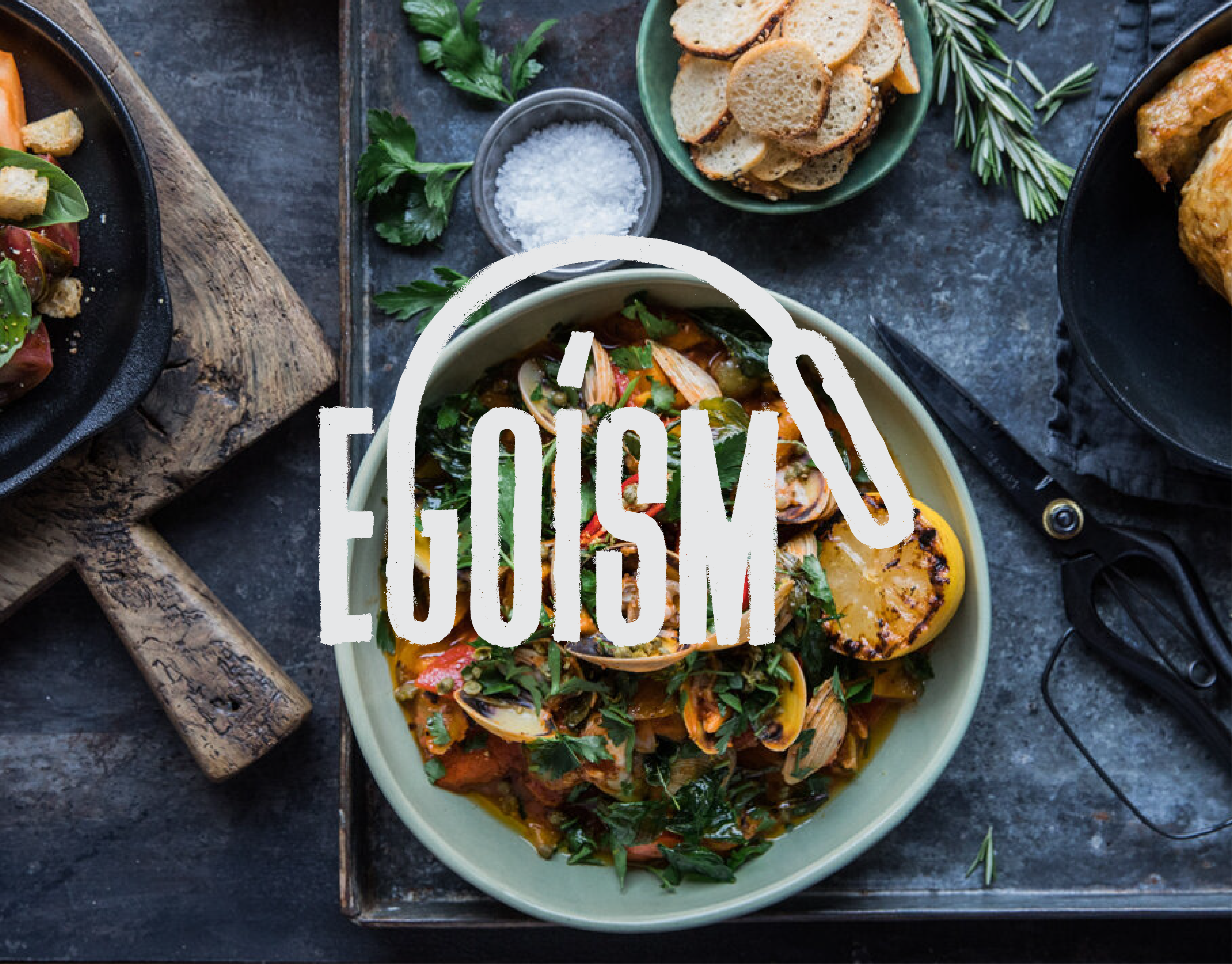
Egoísmo
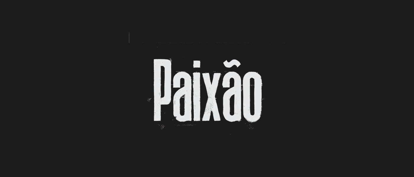
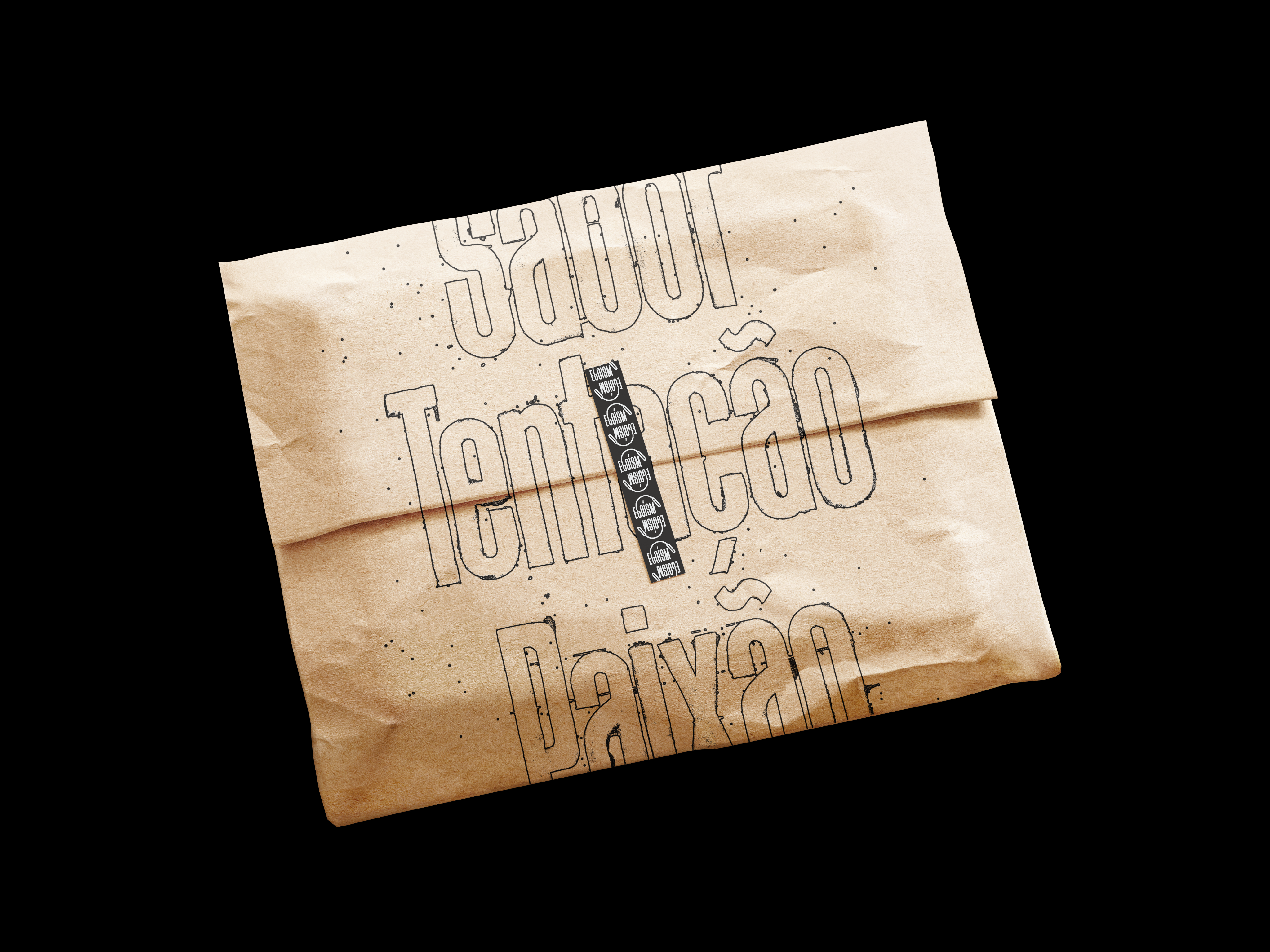
A visual identity concept for a rustic restaurant, so memorable that revealing its location feels almost like sharing a secret.
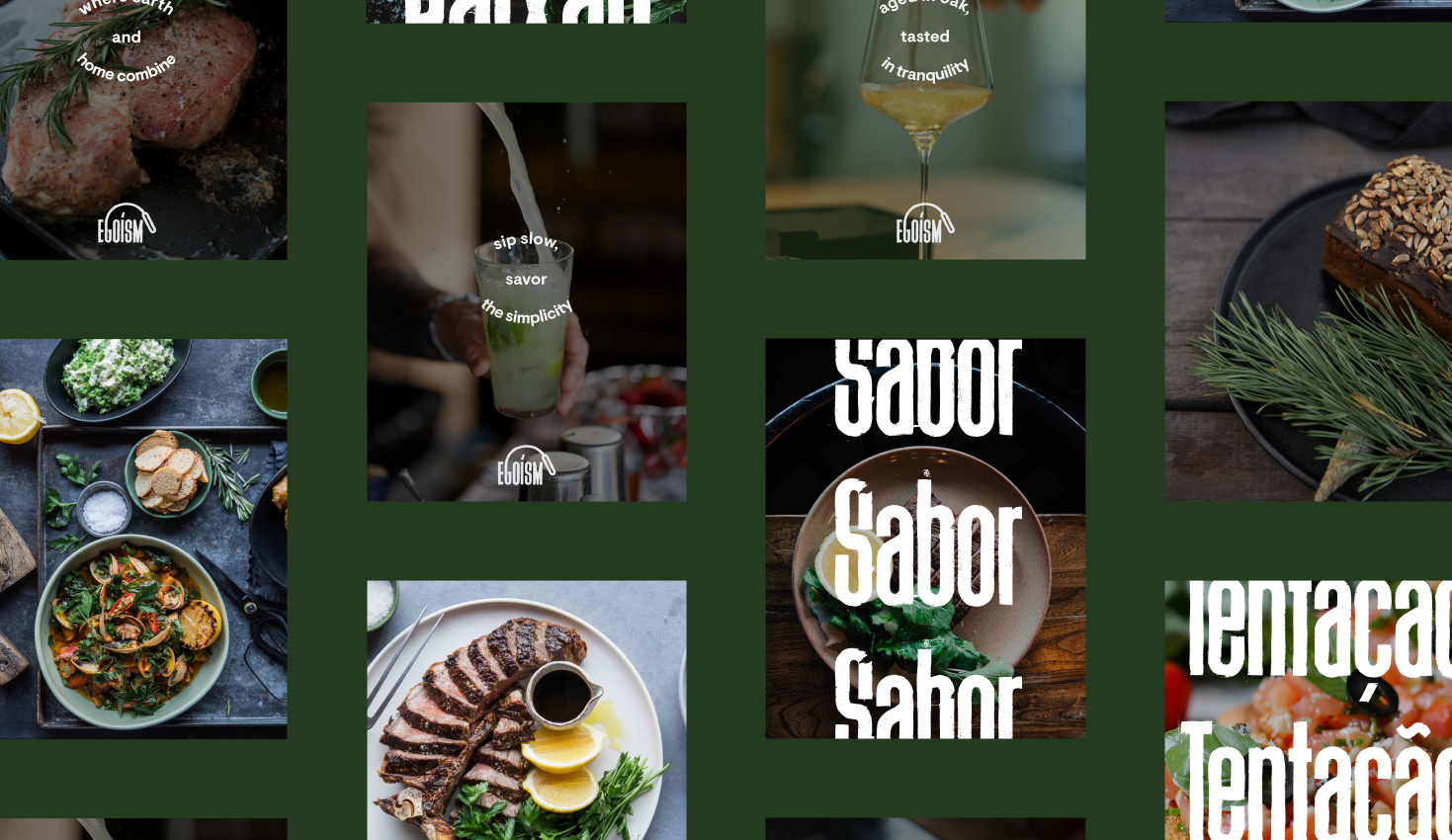
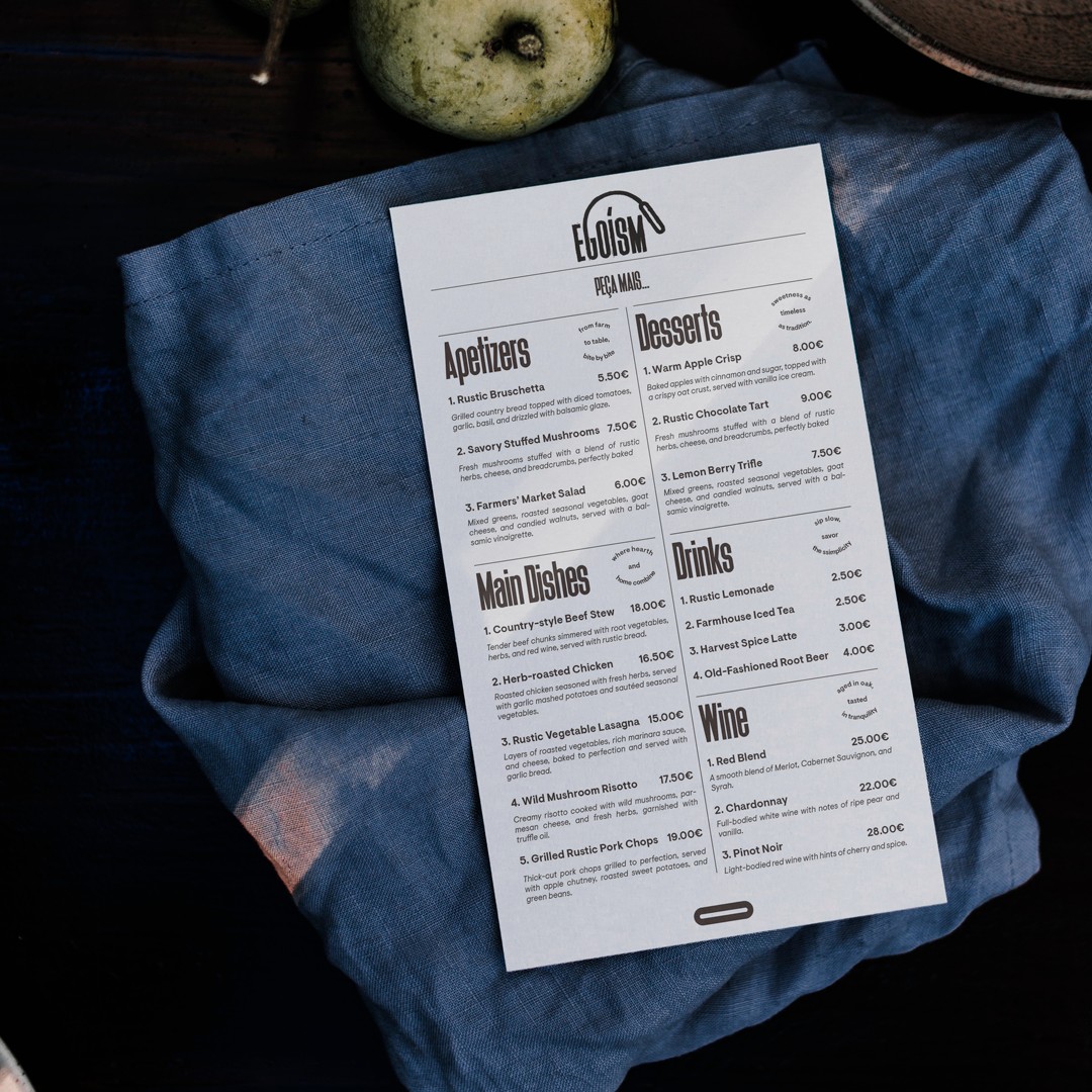
A rich and abundant menu immerses guests in a world of flavours, transforming the dining experience into something personal and exclusive, so memorable that revealing its location feels almost like sharing a secret.
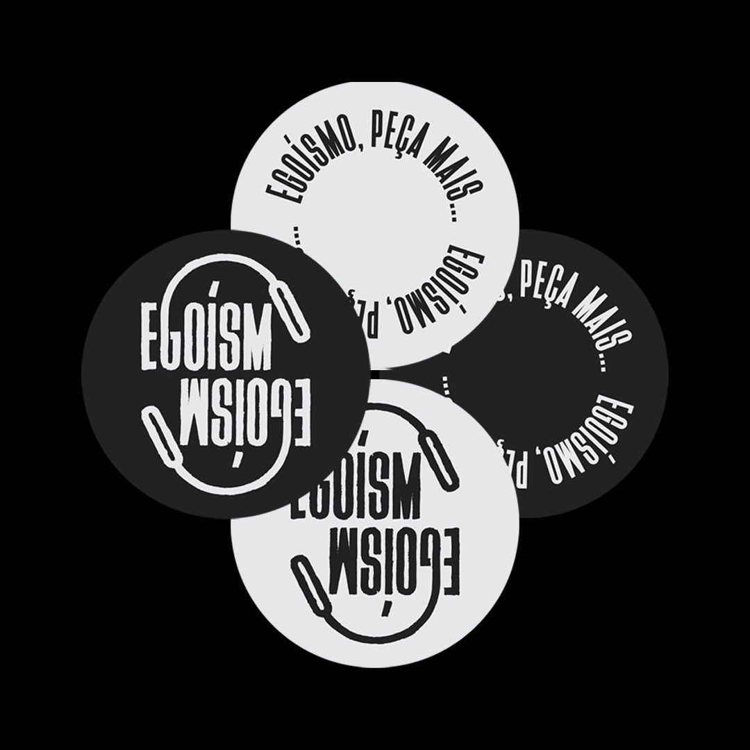
The Egoísmo logo is built around a subtle visual narrative embedded within the word itself. The letter “G”, already positioned beside an “O”, extends forward to reach the final “O”, a simple gesture that symbolizes ego as an active force, always stretching beyond its place to claim more.
The form is intentionally imperfect and slightly childlike, reflecting the instinctive and unfiltered nature of ego. Through its hand-drawn character and quiet irony, the logo balances conceptual depth with an approachable and human presence.
ANO
2021


Energize your brand.
hello@betonikstudio.com

hello@betonikstudio.com
Privacy Policy


Egoísmo
A visual identity concept for a rustic restaurant, so memorable that revealing its location feels almost like sharing a secret.
A rich and abundant menu immerses guests in a world of flavours, transforming the dining experience into something personal and exclusive, so memorable that revealing its location feels almost like sharing a secret.
The Egoísmo logo is built around a subtle visual narrative embedded within the word itself. The letter “G”, already positioned beside an “O”, extends forward to reach the final “O”, a simple gesture that symbolizes ego as an active force, always stretching beyond its place to claim more.
The form is intentionally imperfect and slightly childlike, reflecting the instinctive and unfiltered nature of ego. Through its hand-drawn character and quiet irony, the logo balances conceptual depth with an approachable and human presence.
ANO
2021

Energize your brand.
hello@betonikstudio.com


Privacy Policy
hello@betonikstudio.com

Egoísmo
A visual identity concept for a rustic restaurant, so memorable that revealing its location feels almost like sharing a secret.
A rich and abundant menu immerses guests in a world of flavours, transforming the dining experience into something personal and exclusive, so memorable that revealing its location feels almost like sharing a secret.
The Egoísmo logo is built around a subtle visual narrative embedded within the word itself. The letter “G”, already positioned beside an “O”, extends forward to reach the final “O”, a simple gesture that symbolizes ego as an active force, always stretching beyond its place to claim more.
The form is intentionally imperfect and slightly childlike, reflecting the instinctive and unfiltered nature of ego. Through its hand-drawn character and quiet irony, the logo balances conceptual depth with an approachable and human presence.
YEAR
2021

Energize your brand.
hello@betonikstudio.com


Privacy Policy
hello@betonikstudio.com